MANGO dating app
Role: Product designer
Team: Cross-functional (Designers, Developers and Leadership)
THE BRIEF
Most platforms prioritize high-volume matching over high-quality interaction, leading to a "ghosting culture" where users feel like data points in an endless loop rather than individuals seeking connection.
OVERVIEW
A dating app designed for individuals seeking serious relationships
THE CHALLENGE
How to differentiate yourself from the dating app market that is already saturated?
There are tons of relationship apps out there that target specific niches. If you can name a genre, chances are there's already an app for it, which makes breaking into the market pretty tough. So, why even try? Well, we believe in love. These days, in 2022, looking for a partner online is way more common than it used to be.
THE SOLUTION
SOPHISTICATED ONBOARDING FLOW
We reimagined the entry experience by replacing standard forms with a sophisticated, bold UI that mirrors the gravity of seeking a serious relationship.
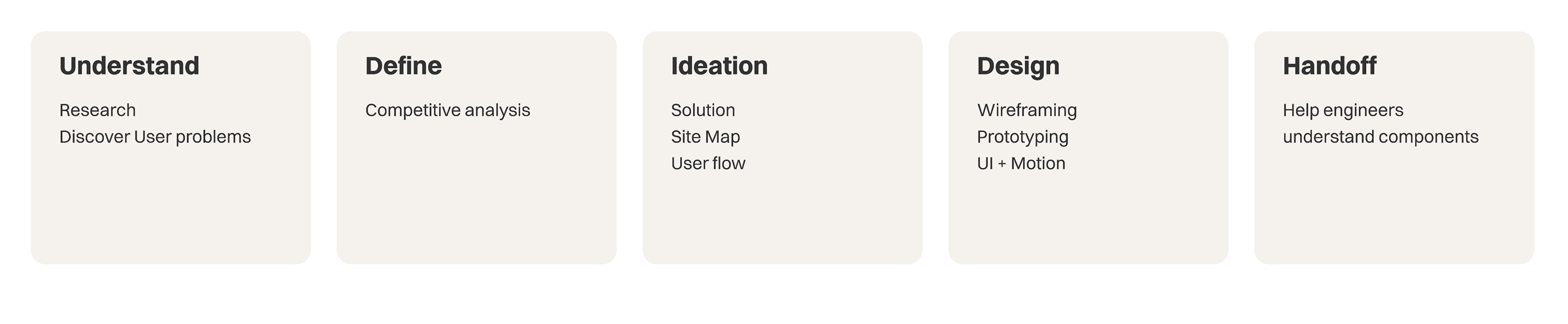
THE RESEARCH
I started an interview with the stakeholder to understand his product objectives and needs for the dating app; We ran a survey with an audience of all genders between 25 and 34 years old because we thought of an audience that would be young and at the same time already in the job market. And a selected audience that was heavy dating app users;
We saw three significant problems:
Too many matches: People who get too many matches also get frustrated and get lost in conversations. Ghostings are frequent, and chatting ends up being superficial or non-existent.
Scammers, fake profiles or inappropriate users: How to make the app safer, especially for women?
All dating apps feel the same: After the invention of the swipe, virtually all dating apps feel the same.
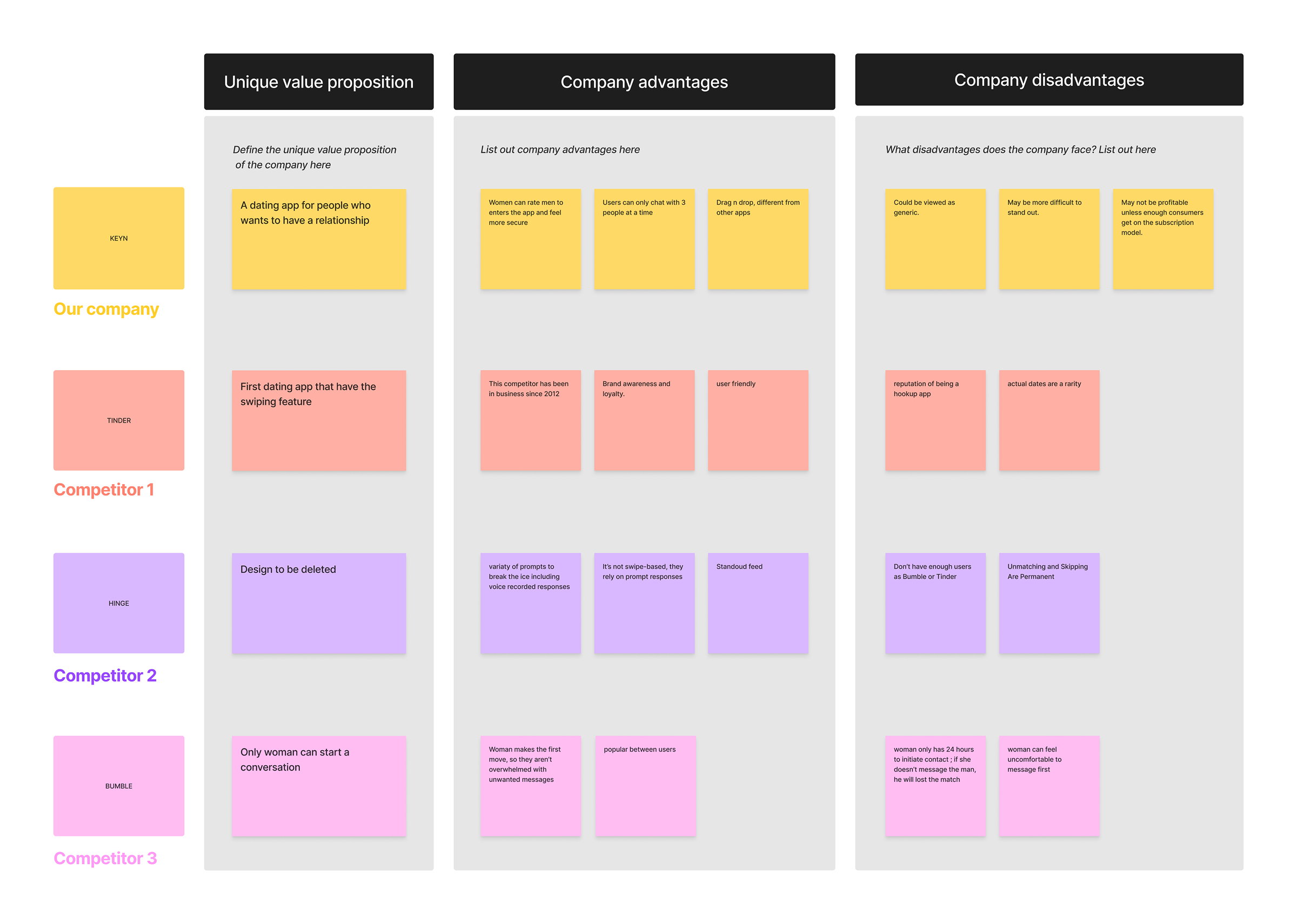
COMPETITIVE ANALYSIS
After that, we did a competitive analysis using our company versus the dating apps that the users mostly use. We documented the value proposition, advantages and disadvantages of each product.
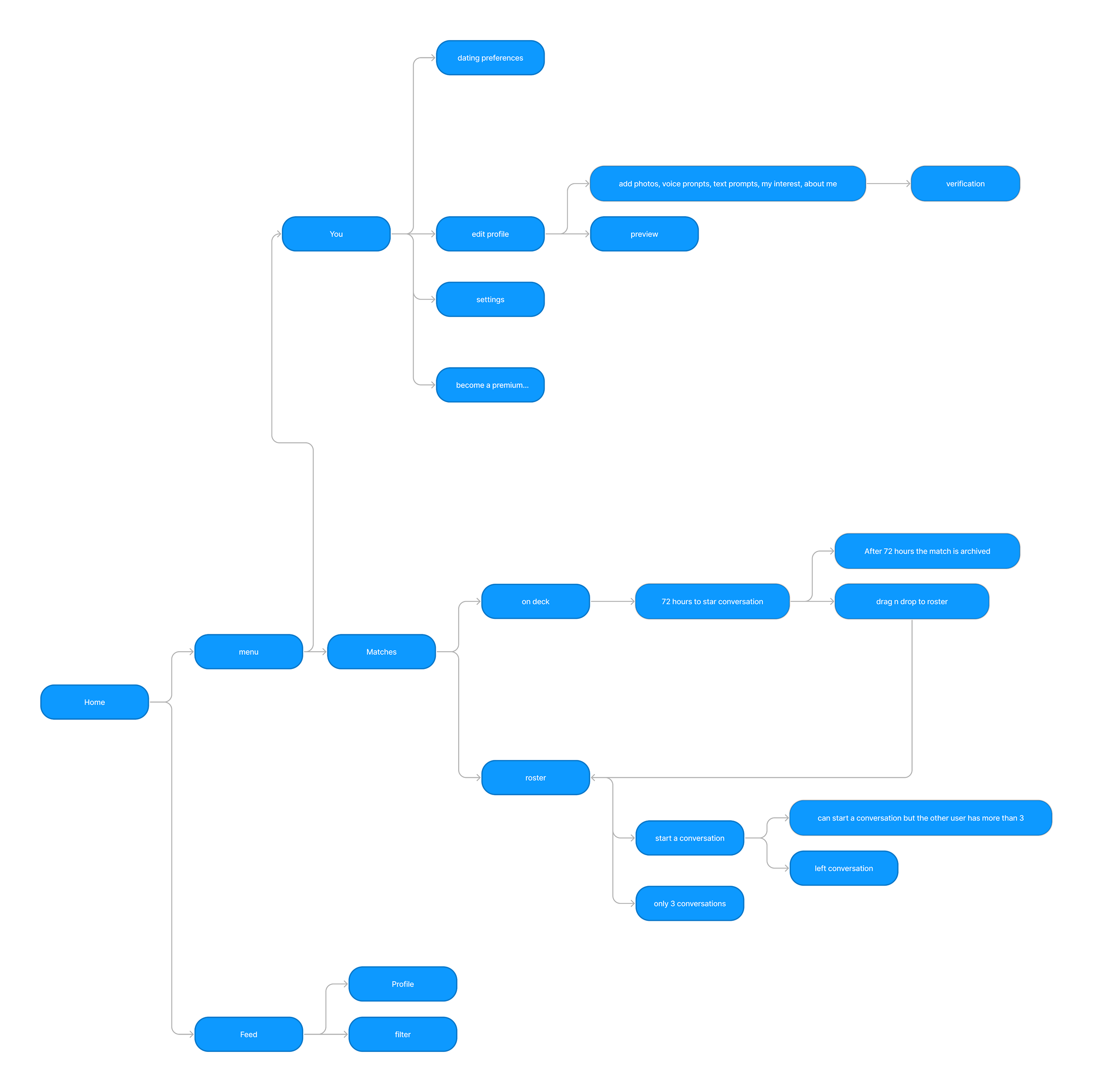
SITE MAP
From the research, we created a User Story to refine resources and made a site map to organize the content.
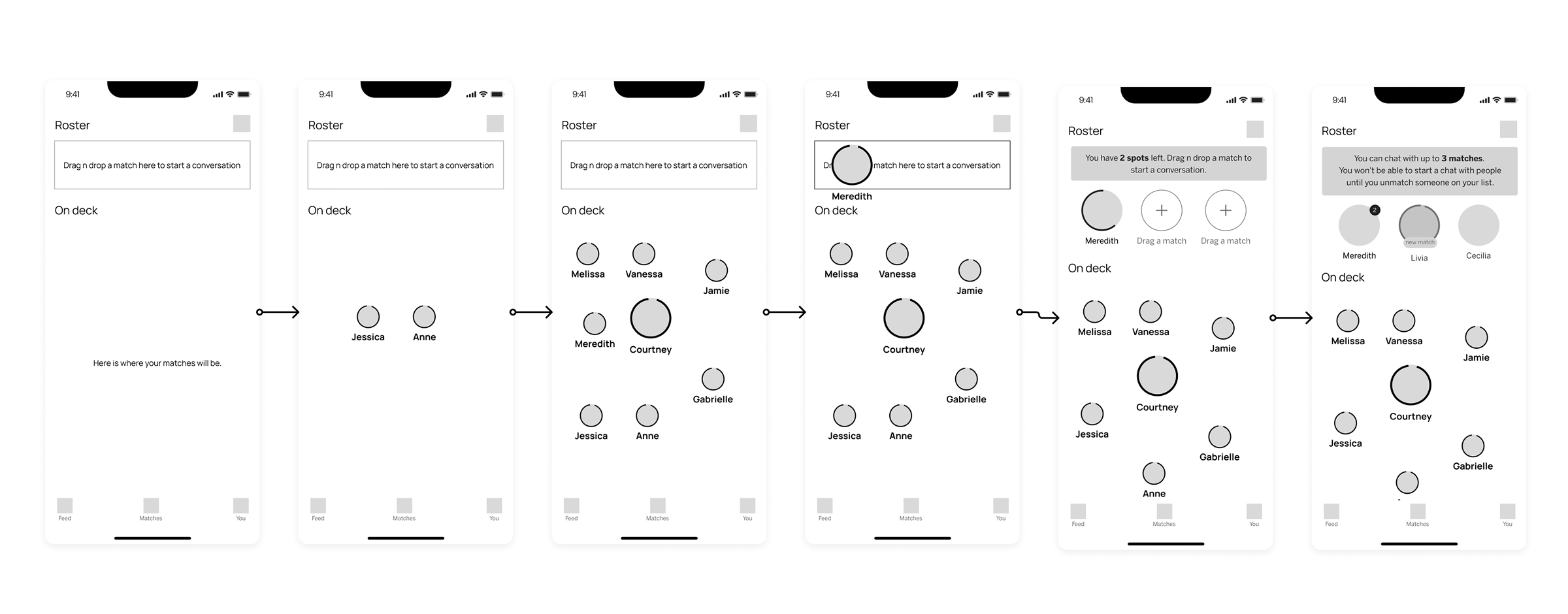
Wireframe
After the organization content I started doing Wireframe and prototype to understand about the flow; Unfortunately duo to contraints, we weren't able to do user testing, but we ended up validating internally.
THE FINAL RESULT
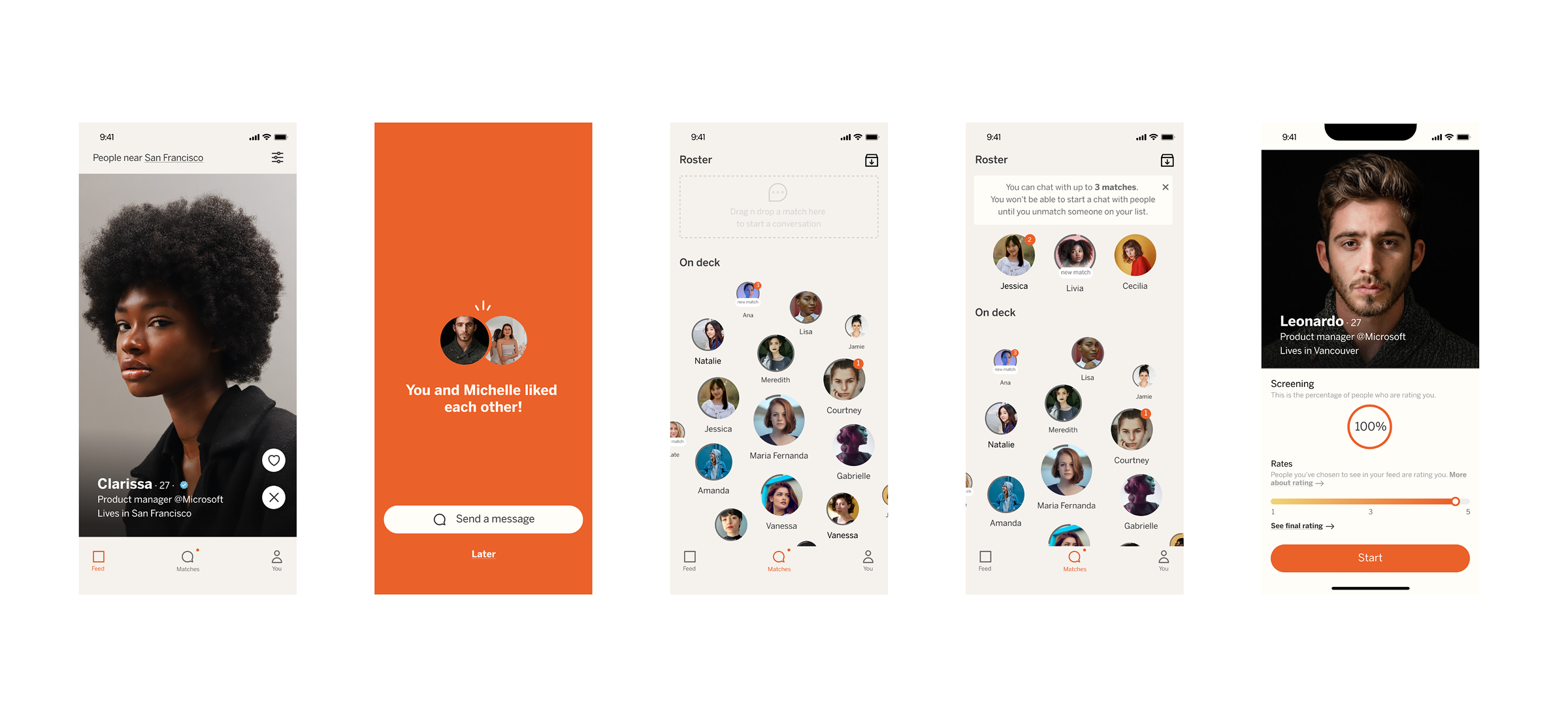
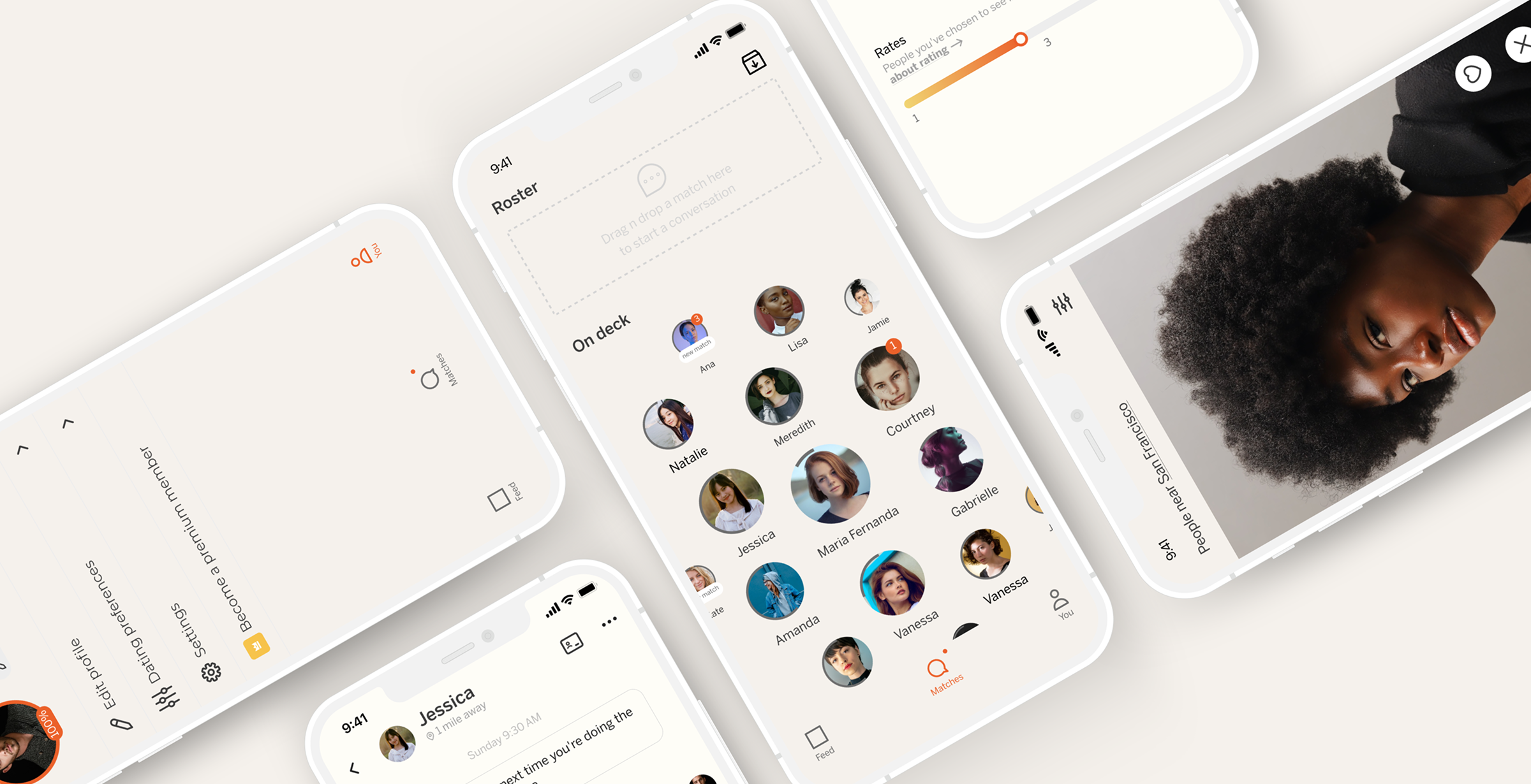
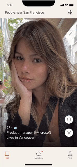
Once the flow is validated, it's time for the UI, where we start creating the product identity.
As much as, in the end, the dating app had the same purpose as the others, we wanted to gain users' trust and be in the market. We ended up opting for something a little different, like a drag and drop when the user wanted to talk to someone and have a limit of people in their conversations.
Another thing that we ended up putting is that straight Cis women have the power to rate the profile of straight Cis men before they can enter the app. It could be something that could avoid fake profiles or even someone who logs in to send appropriate messages.